Green Fig Aesthetics & Wellness
a concept redesign project
SUMMARY
A comprehensive redesign and high-fidelity Figma prototype focused on establishing a cohesive, professional visual identity that aligns with the brand’s core values. I modernized the site architecture to meet web standards, streamlined the navigation system, and re-engineered the contact page to create a frictionless flow for prospective clients.
SERVICES
UX/UI Design
Visual Identity & Branding
Information Architecture
High Fidelity Prototyping
User Flow Optimization

THE CHALLENGE
The existing site suffered from a fragmented user experience, characterized by a repetitive visual identity and a restrictive, narrow-column layout that failed to leverage modern web standards. Redundant pages—specifically for "Hours and Scheduling" and "Contact Information"—created unnecessary friction, indicating a clear need for a more intuitive information architecture to streamline the client's path to engagement.
Original homepage capture before the redesign.
INFORMATION ARCHITECTURE & USER FLOW
To eliminate user friction, I restructured the site’s hierarchy to prioritize clarity and ease of navigation. By consolidating the Hours & Scheduling and Contact Information into a single, unified Contact page, I reduced the number of clicks required for a user to reach out. Furthermore, the global navigation was distilled into four intuitive categories—Services, Products, About, and Contact—ensuring a streamlined and predictable path through the site.

Revised Site Map: A streamlined architecture that simplifies the user journey by consolidating key contact touchpoints and refining the primary navigation.
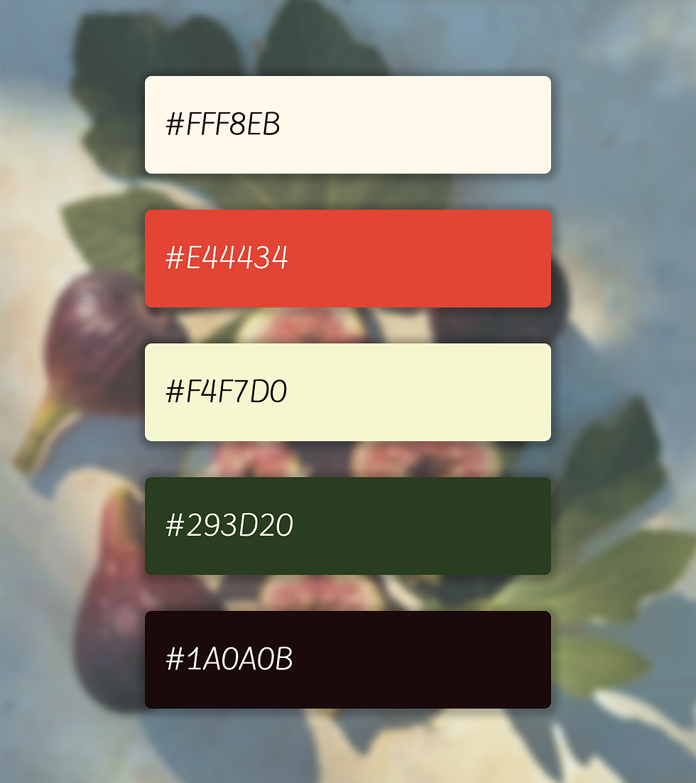
VISUAL IDENTITY & COLOR STRATEGY
The updated color palette was thoughtfully selected to reflect the "grounded and calming" nature of Green Fig’s holistic mission. I anchored the design in a combination of organic greens to evoke stability and restoration, mirroring April’s focus on total wellness. A warm coral accent was introduced to provide a vibrant "pop" to the interface, maintaining a modern edge while preserving the overall sense of tranquility.
Original homepage capture before the redesign.

